We explore how simplicity in design - specifically branding and UX design - and how this minimalistic approach can be beneficial.
Minimalism
We hone in on simplicity in graphic design, specifically branding and UX design. Exploring why this minimalistic approach can be beneficial, and what leading examples there are.
“In its most stripped-down definition, minimalism is about designers expressing only the most essential and necessary elements of a product or subject by getting rid of any excess and, therefore, unnecessary components and features.”
Marc Schenker (Creative Market)
While most trends have somewhat of a short lifespan, the act of simplicity in design appears to be a practice outliving most others, influencing many disciplines – from architecture to technology, furniture to graphic design. Everywhere you look you see creatives putting this into practice, stripping back their work, making design digestible, accessible, and simple.
But why? Is it because it’s a relief to see such uncomplicated yet impactful visuals? Does it make it easier for us to absorb due to shorter attention spans? Or is it simply a breath of fresh air in such a busy world?
We’re going to hone in on simplicity in graphic design, specifically branding and UX design. Exploring why this minimalistic approach can be beneficial, and what leading examples there are.
The art of reduction – simplicity and branding
It could be said that minimal design is under-appreciated, with the view that it wouldn’t take as long, or that it’s perhaps a cop-out. But surely it’s a skill to be able to reduce something down to its simplest form, for it to still be recognisable at the same time as capturing its essence?
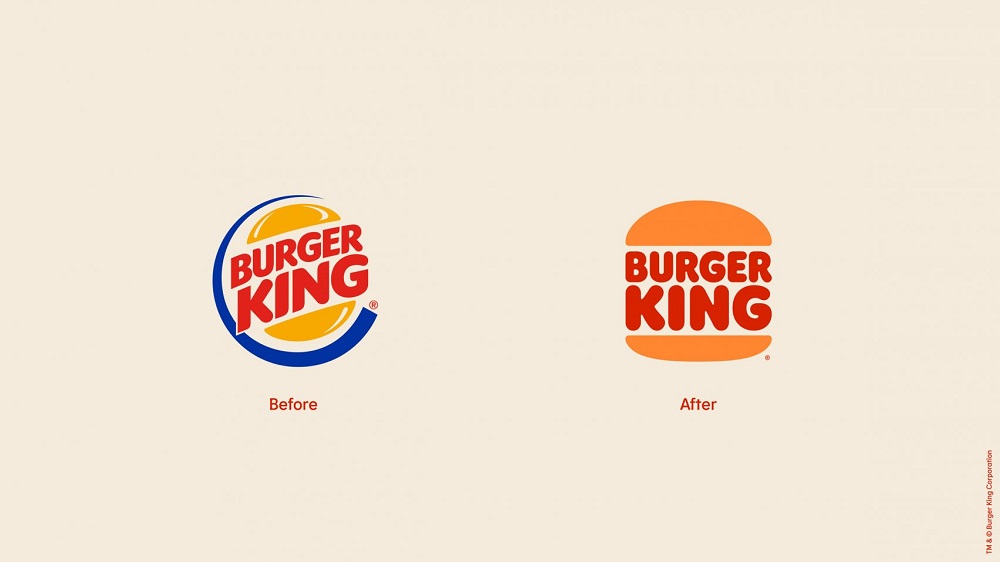
Take Burger King, for example, the way they have stripped back their logo, and developed a brand identity using bold colours, typography-led packaging, and understated layouts, is unapologetic, eye-catching and effective. This rebrand was carried out by creative agency Jones Knowles Ritchie, and they’ve done an exceptional job. “The new logo pays homage to the brand’s heritage with a refined design that’s confident, simple and fun.” explained JKR.
The rebrand was a great success and won them multiple, well-deserved awards. And it’s not just Burger King that is simplifying, other well-known brands such as Spotify, Pringles, Google, Pepsi, and many more have ventured down a similar path, with a lot of success. The simplest logos are often the most memorable, which can never be a bad thing.
“Hicks Law”
An interesting take on ‘less is more’ is seen in UX design, where it is used to help with decision-making. “Minimalism is based on the concept that lies behind “Hicks Law”, which states that the more choices a person is presented with, the more time she/he will need to make a decision. Reducing the number of functions offered on a website page can optimise the user’s approach to decision making.” – Andrea Bascetta (Key Lime Interactive)
From a sales point of view, you can see why this would be extremely important, the last thing you want is for consumers to be put off by the overwhelming amount of choice.
A fantastic example of a company that takes simplicity to the next level, from branding and packaging, to UX and product design is Apple. Their elegant, high-end branding draws you in, it’s selling you a lifestyle, an experience. Even their shop floor is so minimal that it appears relaxing, and this is coherent with their website, although you’re about to make a big investment, you don’t feel as if your hand is being forced, they make it an enjoyable experience, and it’s one of the worlds most successful brands – and that’s exactly why minimalism can be so valuable.
Of course, this kind of identity doesn’t work for everyone, the beauty lies in creating a look and feel that resonates with your brand and help you to stand out from your competitors!
From creative campaigns to full blown brand identity, contact us for creative concepts and strategy, we have a team of experts that would love to help!
