We like a laugh here at C&W! Our Mid-Weight Graphic Designer Imogen explores the role of humour in advertising and design.
Memorable Ads
Just the other day in the agency, we were on the topic of our favourite ads from the past. We all gathered around a computer screen and were showing each other ads that have, for some reason, stuck with us and made a lasting impression. After reminiscing for a while, we started to wonder, what made those ads particularly unforgettable? A common denominator kept popping up: humour.
To give an example, one that had us chuckling was a John West ad from 2000. If you haven’t seen it, give it a watch, it’s bound to bring a smile to your face. The concept is so simple, it’s fun and it’s silly, but most of all it’s memorable. The ad was released 22 years ago and we’re still talking about it now. If you take a look at the current ads John West are releasing now, you could say that they’ve taken a much safer route, and arguably, less memorable.
Why do we love to laugh?
But what is it about humour that grabs our attention long enough for it to retire to our long term memory? Usually, if something is funny, you have to work a little harder to understand it, leading to longer interactions, and more reward, therefore, the audience is more likely to feel included in the process, they’re now ‘in on the joke’ and feel more connected to the brand. Another reason it can be so impressionable, is because it adds a human element to a brand that may normally seem removed from the average person, it builds bridges and creates emotive connections, which is an integral pillar of advertising.

Hidden meanings
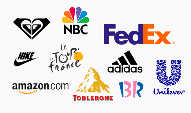
Humour doesn’t always have to be so obvious either, it can be clever and unassuming. Take for example, the FedEx logo, a classic example of hidden meanings and thought provoking design. The hidden arrow between the ‘E’ and ‘x’ is a masterpiece, so simple, yet utter genius.
Other logos containing more hidden meanings continue to amaze and amuse us, years after the’ve been created, such as the Toblerone logo, and their hidden bear in the mountain range, or the’ a-z smile’ in amazon; the hidden meanings provide layers and hold the audience’s attention, as well as showcasing their attention to detail. We’ll leave you to figure out the rest of the hidden meanings…
A new direction?
As much as we love laughing until we’re crying, humour isn’t always appropriate; firstly, not everyone has the same sense of humour and what could be meant as a joke, could go terribly wrong ending in some sort of crisis management (I’m sure we could all think of an example of this). And secondly, a common trend we see now, is advertisements designed to pull on the old heart strings. This moves away from light hearted comedy, and taps into raw emotion, a completely different technique, but potentially just as effective.
Whatever strategy you’d like to explore, or emotion you want to tap into, we have a team of creative experts that would love to get stuck into and challenge a brief. Contact us today to chat through yours.


