How did we help?
Brand strategy
Tone of voice
Logo development
Market Research
Design Style
Brand Guidelines
Goal
To modernise the Devon Air Ambulance brand so it aligns with their strategic vision for the future
Client: Devon Air Ambulance
A sudden, serious illness or injury can happen to anyone. Devon Air Ambulance are fully equipped to provide crucial, time-critical care at the scene.
As a fully independent charity, they are reliant on raising funds and needed to modernise their brand to align with their strategic vision for the future.
Devon Air Ambulance’s visual identity hadn’t been updated in quite some time, and, with a brand so embedded in the hearts and minds of the Devon community, it was vital to get it right.

Refining the strategy.
Prior to our appointment, a lot of work had already gone into the development of a business strategy and corporate values for Devon Air Ambulance (DAA.) Our objective was to develop the brand values and align these with what was already in place.
We held a collaborative session with the core team to really explore the audience, competition and personality of the brand. The work gave more depth to the corporate values and insight into how they could be communicated through key messages to the external audience.

The Tone of Voice.
As Devon Air Ambulance are a fully funded charity, it is vital that their communication and tone is pitched right to resonate with their audiences so with the strategy clear, we looked to develop a Tone of Voice that would reach people in a more impactful and emotional way.
We utilised various writing techniques and developed a Master tone that the client was happy with and then looked at how it should be adapted for the various different audiences and stakeholders that DAA need to engage with.
The end result is a clear and cohesive approach to communications that supports the brand values.

Developing the logo.
The previous DAA logo had been in place for a long time and is recognisable across the region so it was important to maintain the equity of this. The helicopter graphic is a key part of the logo so we explored different ways of visualising it, from a more traditional interpretation to a more modern approach. We also presented different graphics which had connotations of the helicopter, such as the blades.
This gave the client the freedom to choose from lots of different options, whilst at the same time being confident that all of them were strategically correct.


Market Research.
It was important to the client that the logo was tested with different audiences because many people have felt strongly connected to the charity over the years and it was vital to bring them along on the journey.
Working with a research partner, we conducted focus groups with both staff and external people who had varying levels of commitment and knowledge about the charity. We gave them some key messages and asked for their feedback on three of the selected logos, as well as testing their response to three potential straplines which summarised the emotive service from DAA.
The responses were invaluable in refining and shaping the logo towards a more detailed, classic graphic, even down to ensuring that distinctive elements of the actual DAA helicopter were included.

Brand visuals.
Once the logo was finalised we created an overall brand style guide, showcasing how the logo and strapline would be brought to life and further supported with secondary colour palettes, graphic devices, different types of imagery from stylised to functional and additional brand fonts to bring headers and content to life.
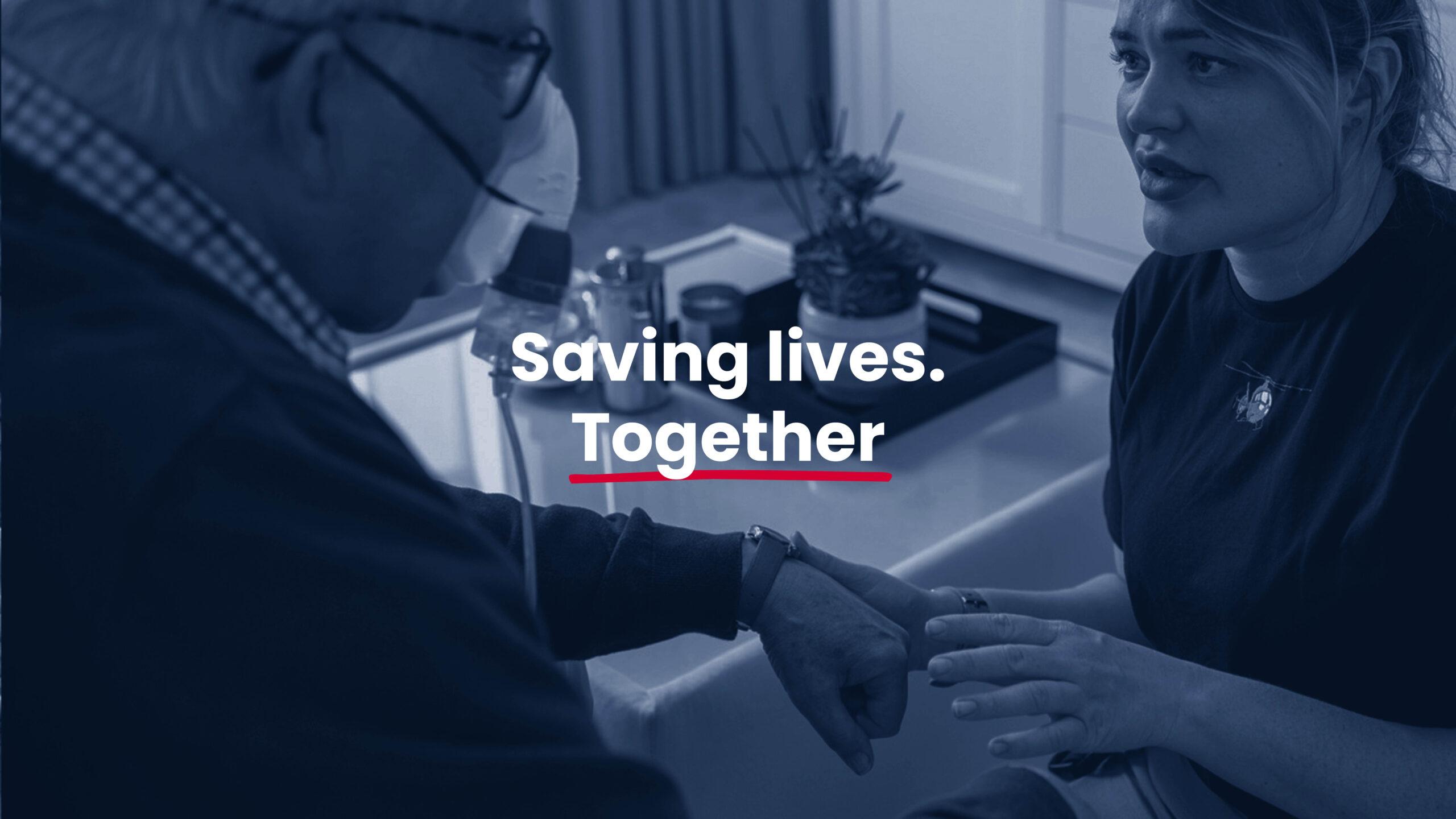
The chosen strapline was ‘Saving Lives Together’ so we included hero imagery of the people behind the scenes, the volunteers, the pilots, the retail staff, etc. which really highlights how important everyone is – they are ordinary people doing extraordinary things.
We also demonstrated how the brand would be visualised on collateral such as shop signage, posters and stationery and developed a brand guidelines document so we create a consistent look and feel which could be followed on to the website.

A new path forward.
We are incredibly proud to have been involved in the creation of a new, modern brand for DAA which sets them on the right path to fulfilling their strategic goals and objectives for the future.

Testimonial
“We were confident in appointing Chalk & Ward that they had both the strategic mindset and creative experience to be our partner in the process. They utilised market research to allow us to test the logo designs and straplines with the public and our staff, allowing us to be confident in our decision.
The end result is a modern, authentic representation of our aircraft and with our new visual design and tone of voice, we are proud to showcase the future of Devon Air Ambulance.“
Matthew Bell / Director of Public Engagement / Devon Air Ambulance