How did we help?
Brand strategy
Brand Logo
Sub-brand design
Pump clip and packaging design
PR
Web Development
Collateral design
Goal
Leverage existing brand equity to launch an even stronger brand
Client: Hanlons Brewery
Hanlons Brewery, formally known as O’Hanlons is situated within Half Moon Village, Devon
Supplying some of the UK’s favourite ales, such as Yellow Hammer, Port Stout and Firefly Bitter, the new owners bought the brewery with an aim to deliver popular ales with distinctive flavours.
The strategy behind a brand
As new owners, they were keen to refresh their branding, driven by the desire for a modern approach with quality and consistency at their core. Their initial intention was to re-name the brewery ‘Yellow Hammer Brewery’ after their most popular product and had been to another agency with the same brief. Whilst the other agency simply responded to this, we challenged the idea on the strategic basis that the existing name retained history and value and should therefore be maximised, not discarded. There would also be brand hierarchy issues when you have Yellow Hammer ale from Yellow Hammer brewery.
Our recommendation was to instead drop the ‘O’ and re-name the brewery Hanlons. This retained the equity of the brewery name with suppliers but the Irish connotations were removed and the brand was instantly refreshed, allowing us to build a new presence and reputation for the brewery.
The key to this project was to develop the brewery brand in such a way that it remained rooted in the history, quality and brewing standards of the brand but brought to life in a fresh, contemporary way.
Bringing the brand to life
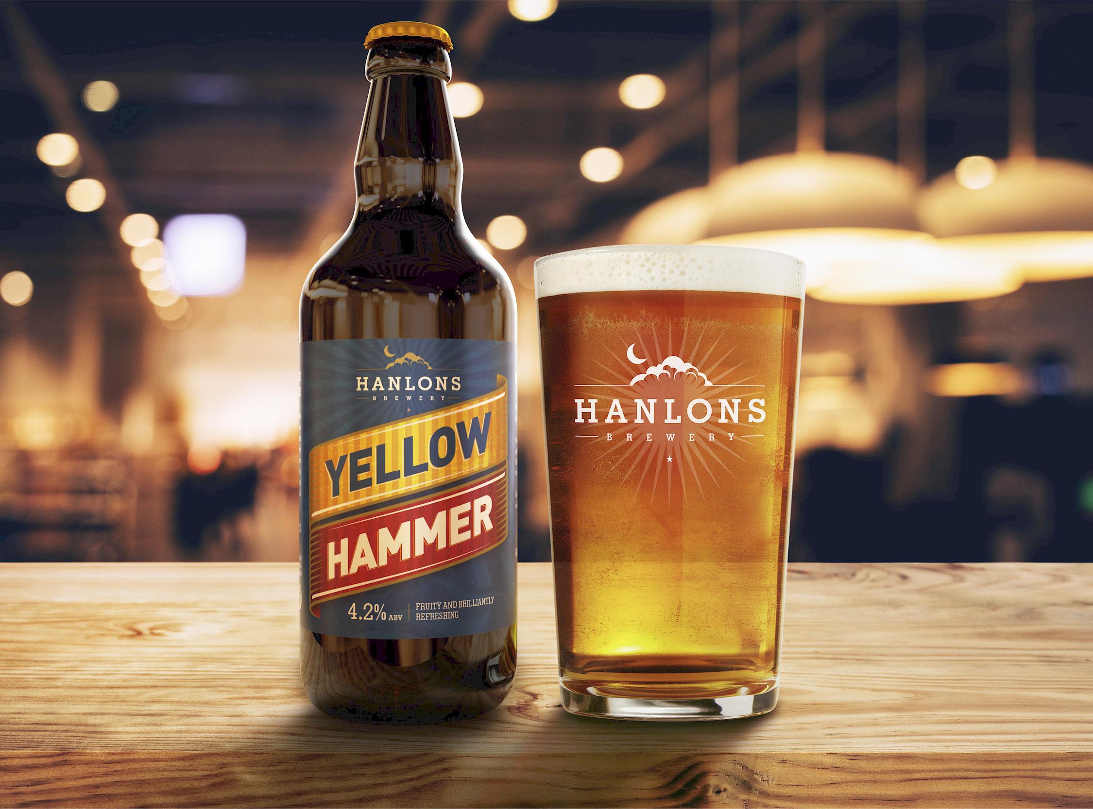
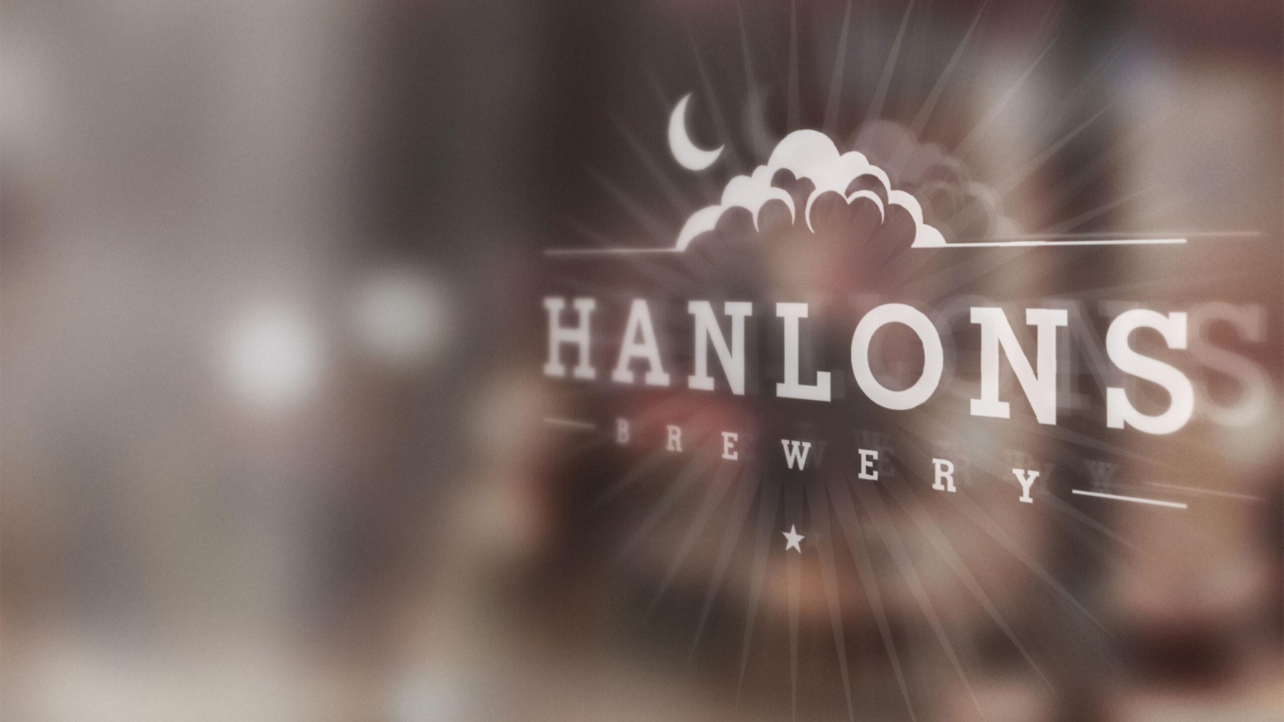
With the new name we needed a new brewery logo. The logo we developed kept the same colours from the previous logo but it now reflected the Half Moon location and gave a distinctive identity for the brewery which could elevate it above the individual ale products and start to build consumer awareness on its own. The intention was that customers could spot the Hanlons logo on any product and be confident of its quality, even without trying it.
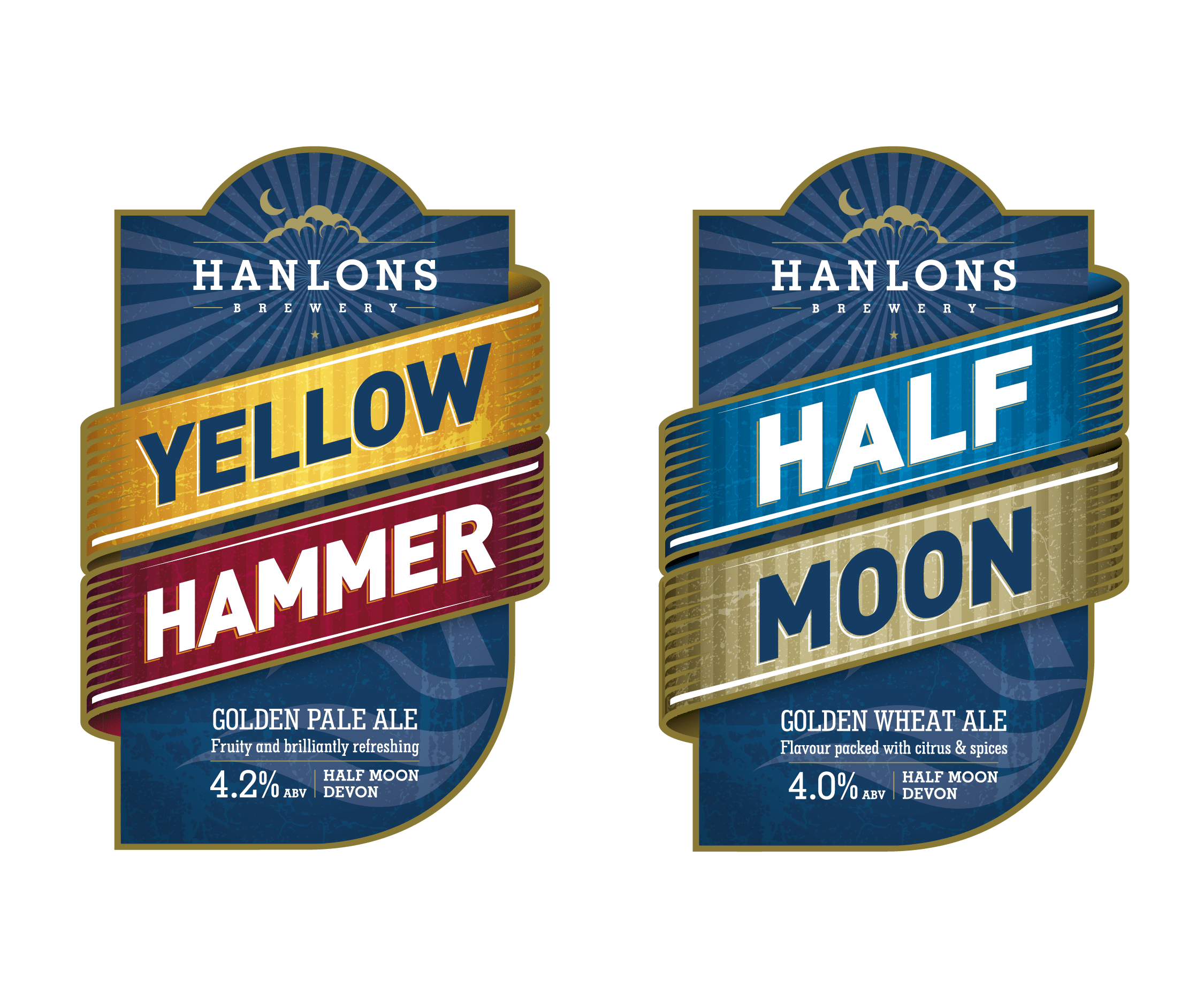
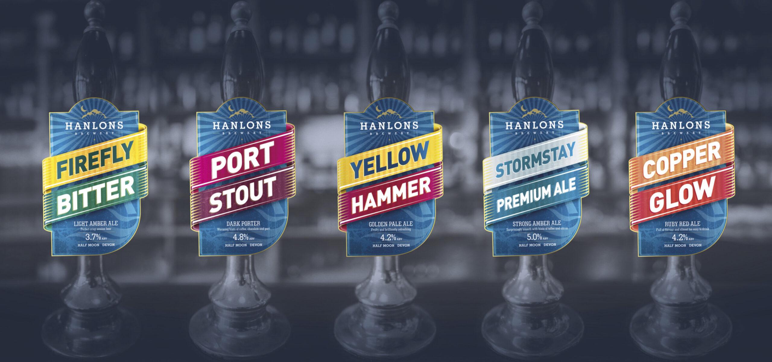
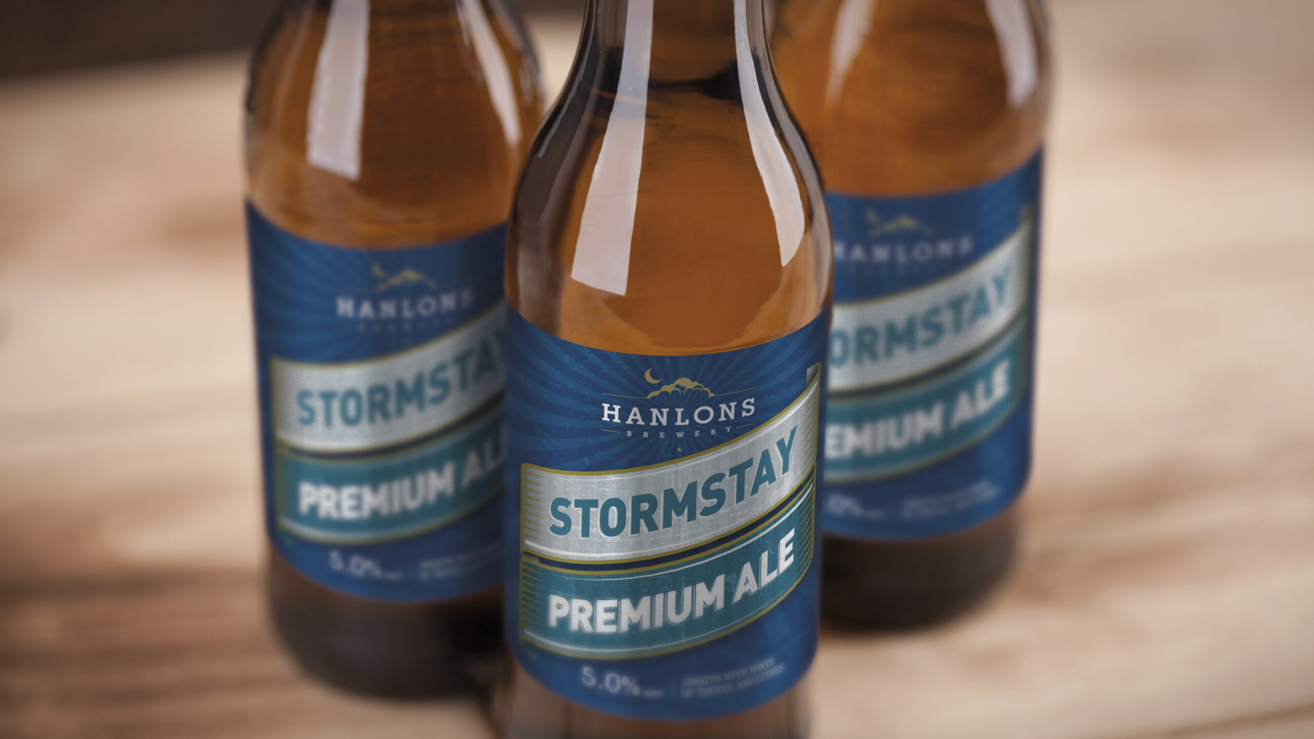
The next priority was ensuring the ale range was also modernised whilst again, retaining a feel of the original designs so that customers could still identify their favourite ale at the pump. We needed to create a look and feel that tied all the different ales together as being of the same Hanlons family, whilst giving each one a distinction which allowed for new ales to be created in the future.
Launching the brand
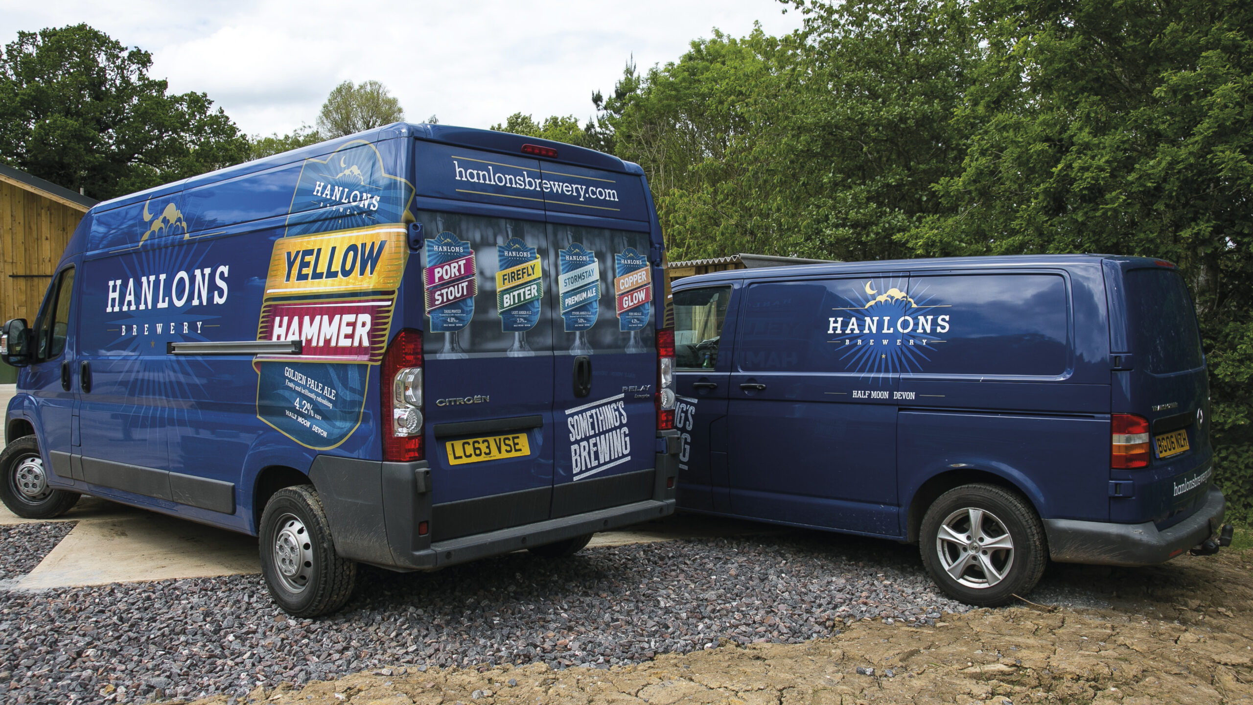
To create a feel of excitement, we developed the concept of ‘Something’s Brewing’ which was used across all collateral at the outset. We created a website holding page, van livery and a unique, good quality supplier leaflet which was key to securing trade relationships.
Chalk + Ward designed the original website and managed the launch event as a PR project which was held at the Brewery.
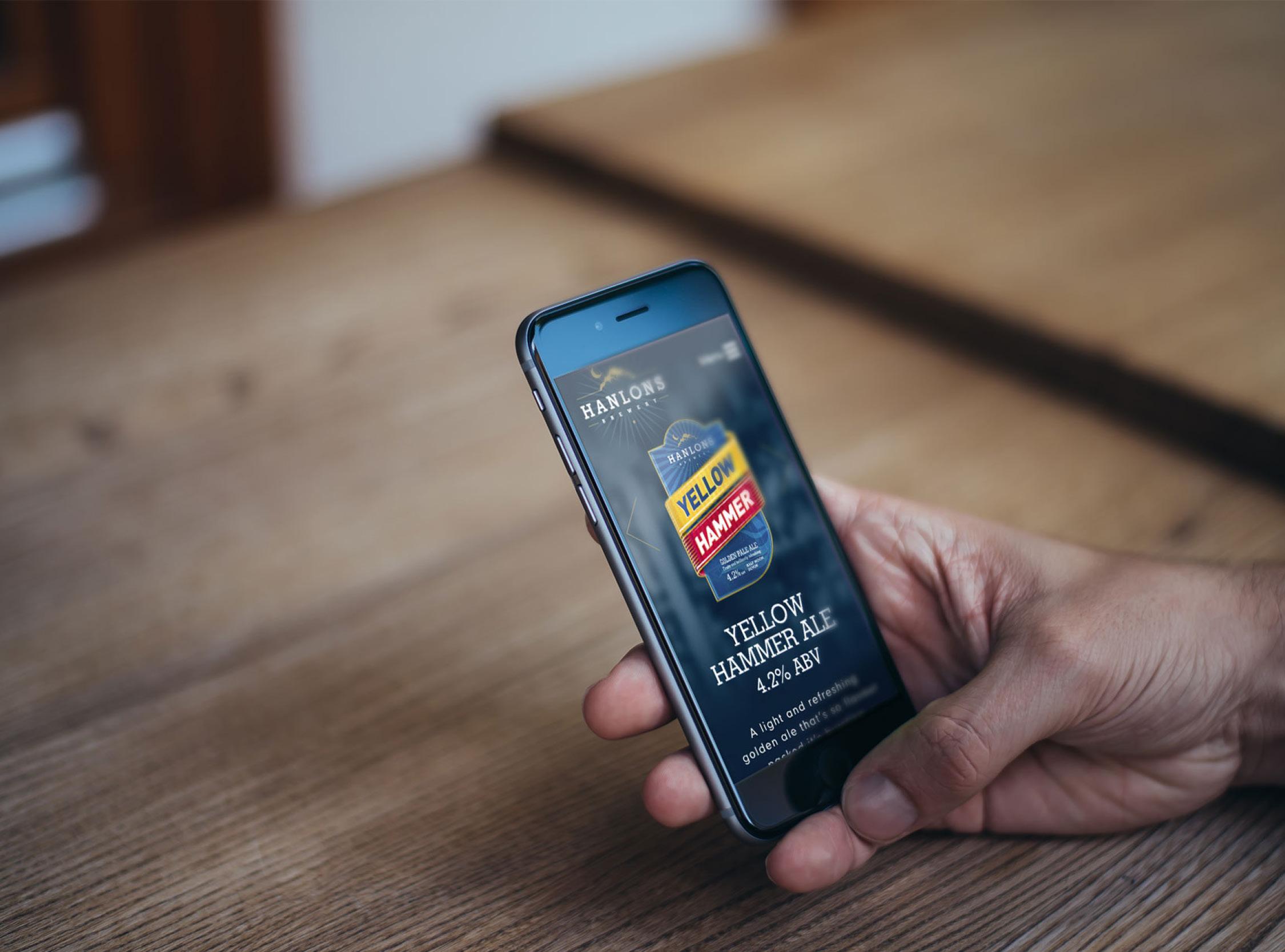
The new branding was implemented across multiple platforms, all of which was extremely well received by landlords and customers alike.
The business has been growing steadily since then and is a strong brand in the South West – an outcome which could have been very different if it had launched as Yellow Hammer Brewery.
Take a look at our Food & Drink page to discover your missing ingredient.
Testimonial
“We really appreciate the transparency and strategic thinking of Chalk & Ward. Their recommendations when it came to creating our fresh brand identity ensured we achieved exactly what we set out to do; retain the loyalty of existing customers while continuing to grow the Hanlons brand and business. The feedback we received on the new brand was excellent and it’s now a recognisable sign of quality in the South West.”
Dan Taylor / Owner / Hanlons Brewery
