How did we help?
Brand strategy
Tone of voice
Logo development
Design style
Brand guidelines
Website design & development
Collateral design
Signage
Goal
To modernise an historic learned society and create a brand befitting a world-class research facility
Client: Marine Biological Association
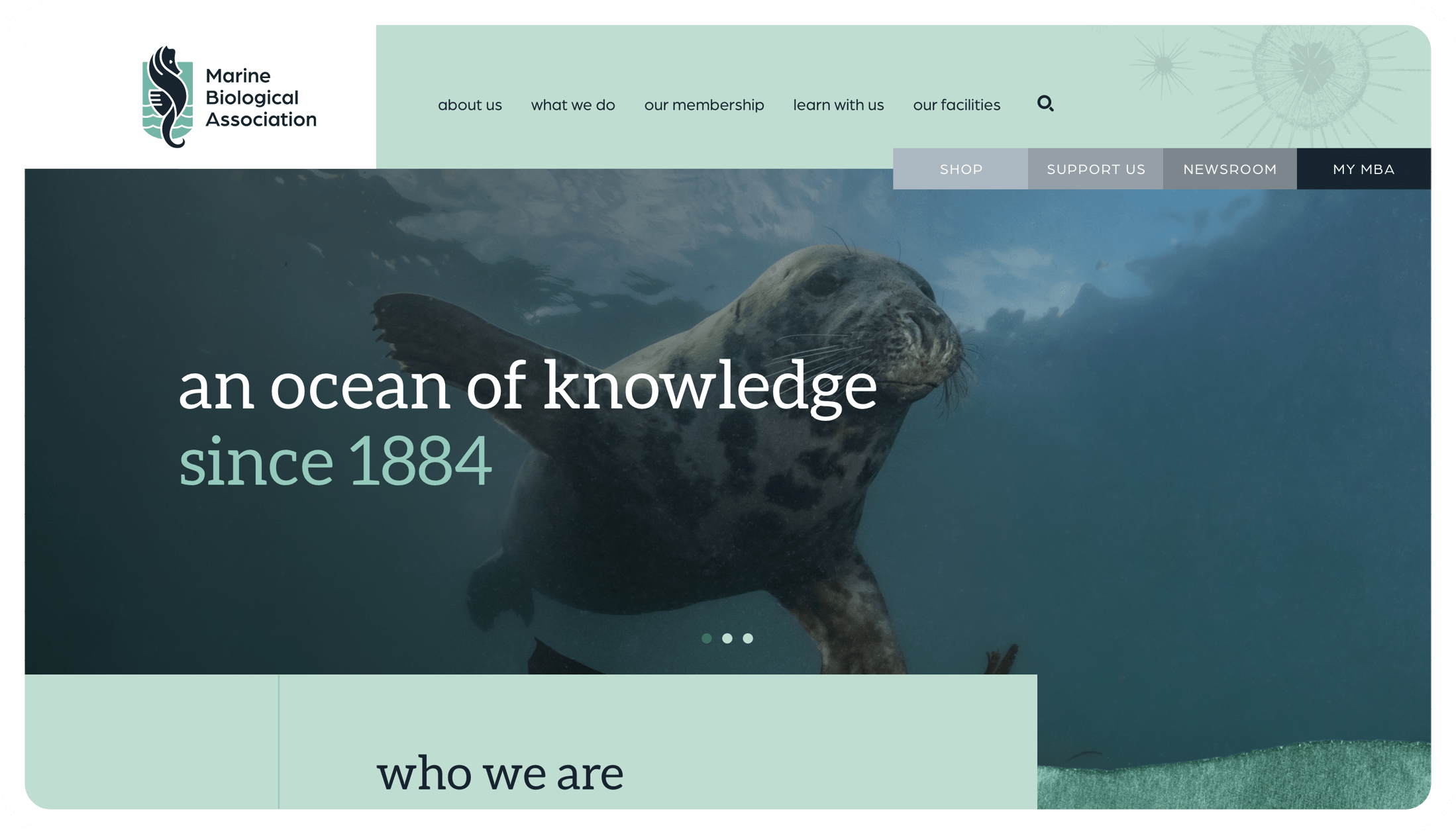
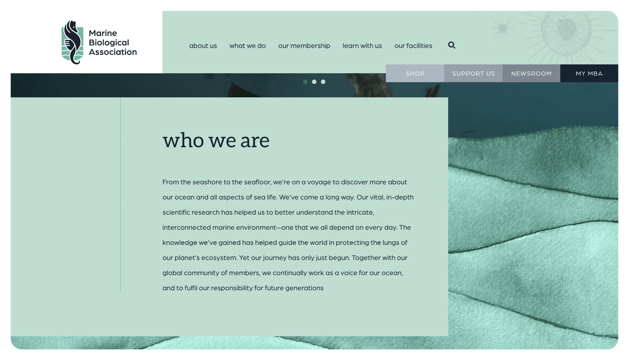
From the seashore to the seafloor, the Marine Biological Association (MBA) is on a voyage to discover more about our ocean and all aspects of sea life.
Founded in 1884, they are one of the world’s longest-running societies dedicated to promoting research into our oceans and the life they support


Understanding the brand.
The brief from the Marine Biological Association was to modernise and strengthen their brand to clearly reflect who they are, what they do and to equip the MBA for a more competitive and globalised future. We held a collaborative session in which we discussed their strategy, the business objectives, how the current Values were chosen and how they saw the MBA growing in the future. We were also able to explore their broad range of stakeholders and define their audience into 8 distinct groups.
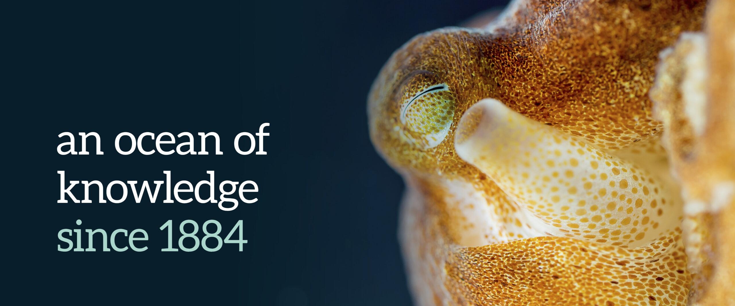
A Tone of Voice for all occasions.
It is vital for a brand to have a cohesive, clear tone of voice (TOV), especially when they have such a broad range of stakeholders, as is the case with the MBA. It’s important that a brand’s voice always stays the same and is consistent to the brand personality but the tone can adapt and change depending on who they’re talking to, e.g. MBA members, politicians, staff or general public, etc.
The tone of voice document is an invaluable reference guide for the MBA and C&W teams to use on a daily basis and build the brand consistency.
Developing the logo.
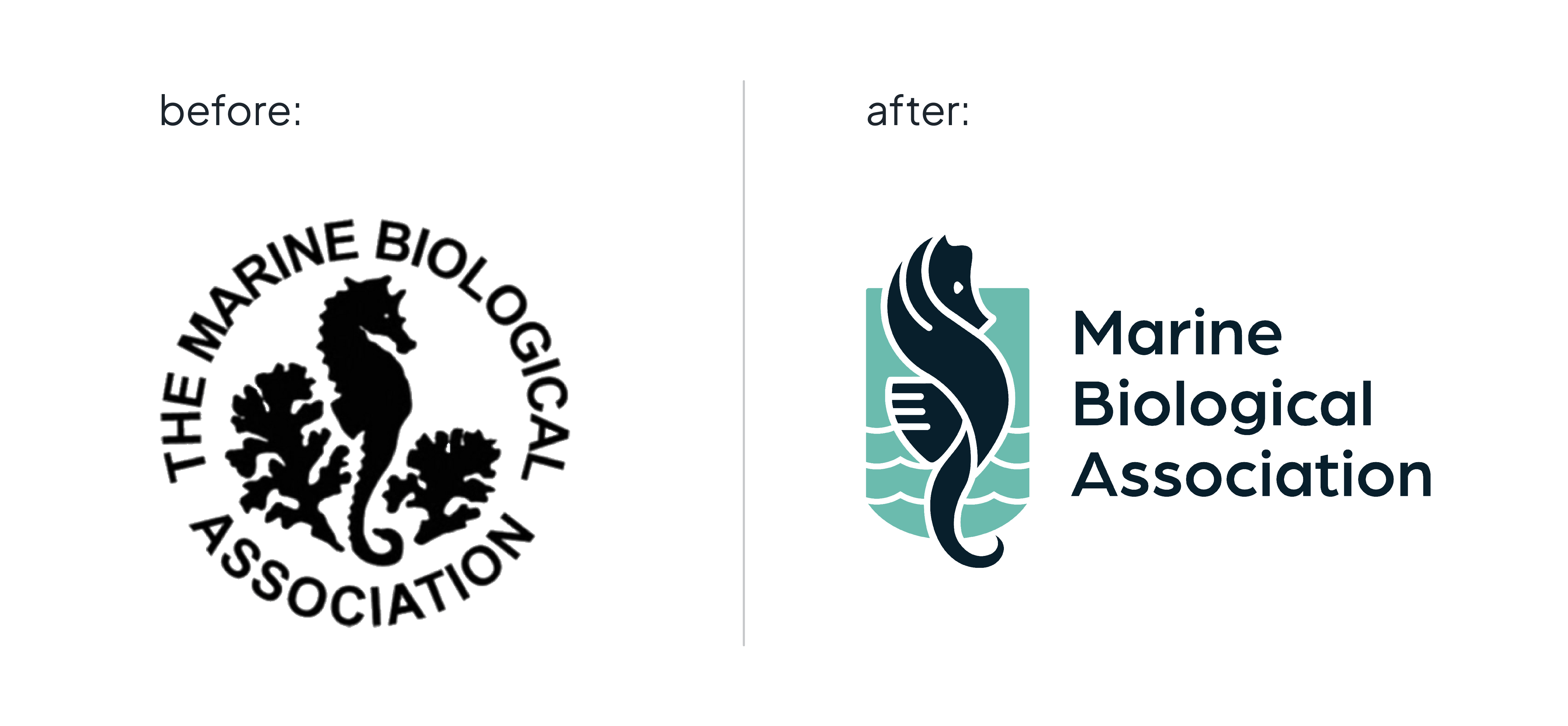
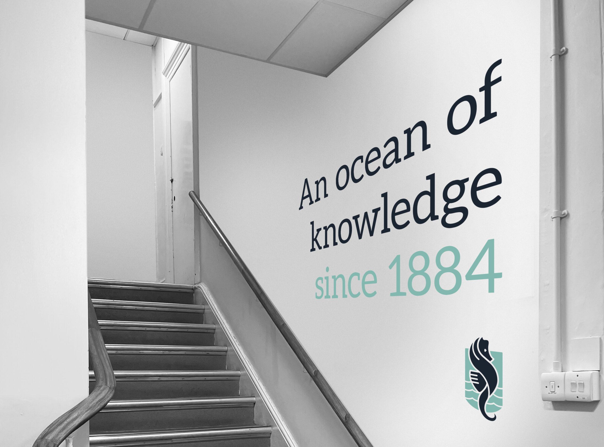
When we approached the logo part of the project, we were very aware of the history behind the MBA and their desire to modernise the brand whilst at the same time, not wanting to move too far away from their roots and heritage.
The final logo reflects both the history and future of the MBA and has been an important step for the organisation in taking a more purposeful step forward in continuing to drive the global presence and excellence of the MBA.
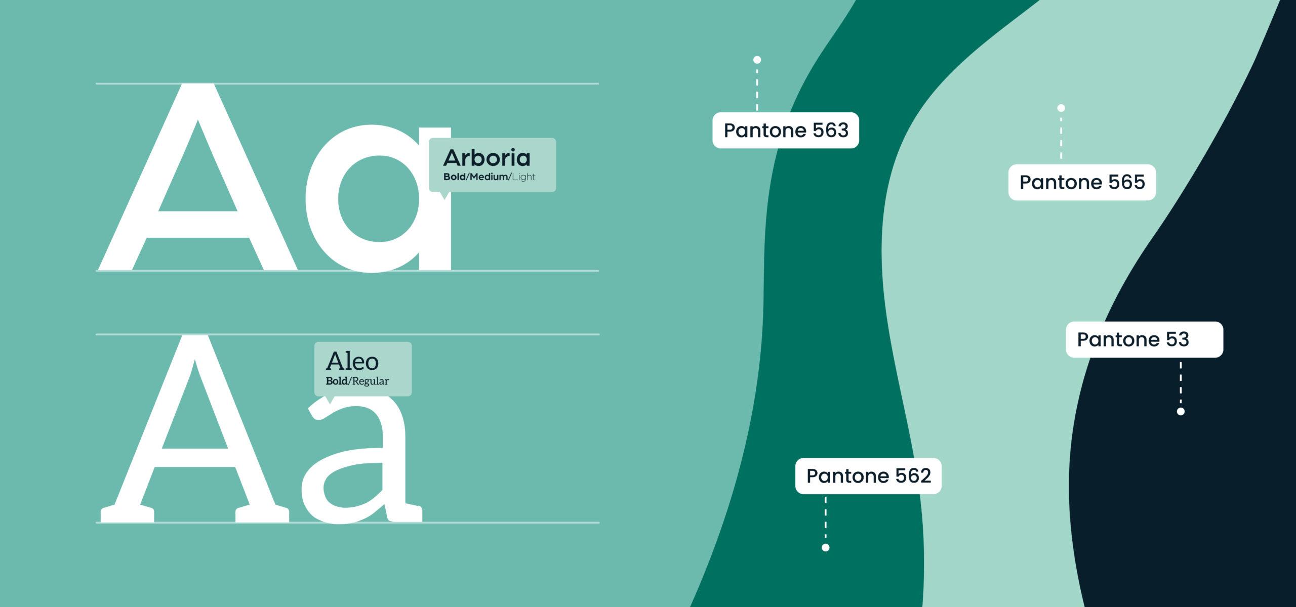
Creating a brand style to be proud of.
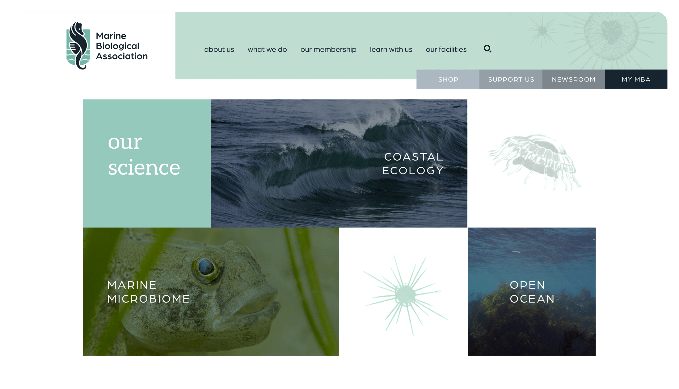
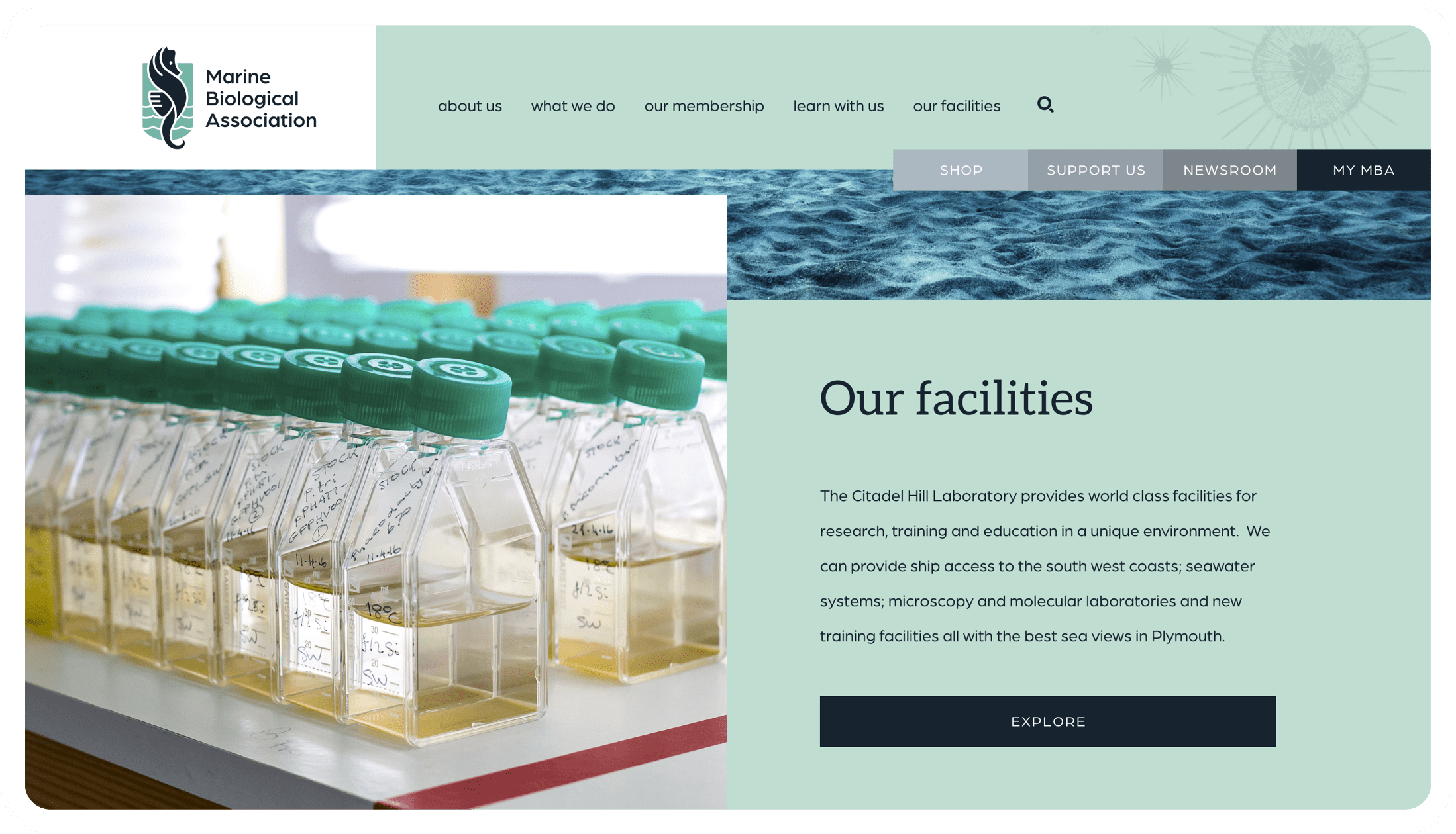
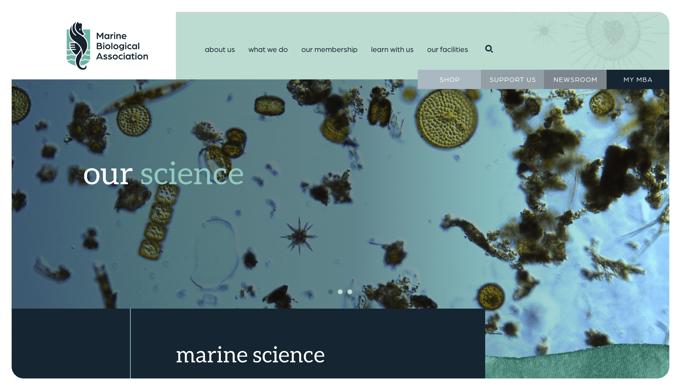
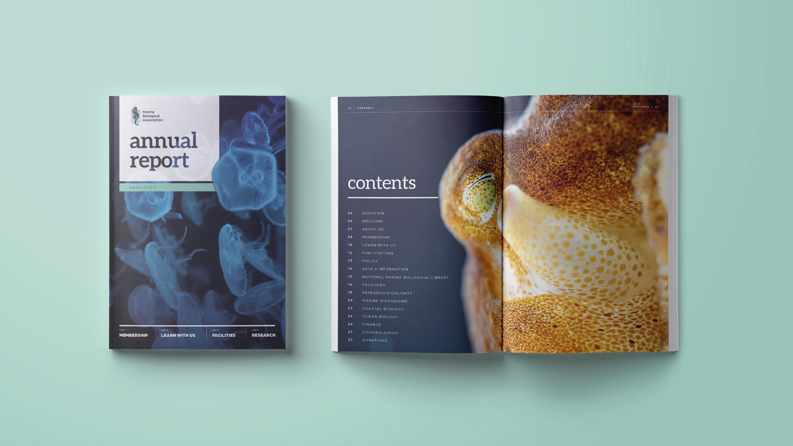
Once the logo was signed off we were able to expand this into the brand design style to create an overall visual look and feel, including colour palettes and graphics. Images were all taken from the MBA’s extensive image library to reflect all the different elements of research they undertake and we introduced the illustrations as a watermark feature to provide textured backdrops to designs. The final design style ensures that all ongoing design will be consistent with the brand.
We also developed the Brand Guidelines document, putting in place the rules of usage for the brand logo and design, again creating much needed consistency going forward.
A website to bring the MBA together.
It all started with a 49 page PowerPoint document in which the client had detailed every page of the current site and provided a topline overview of the requirements of the new site – it was the most comprehensive website brief we’ve ever had! We always start every website project with a scoping meeting to get all the objectives and requirements laid out so the client’s brief was a great starting point.
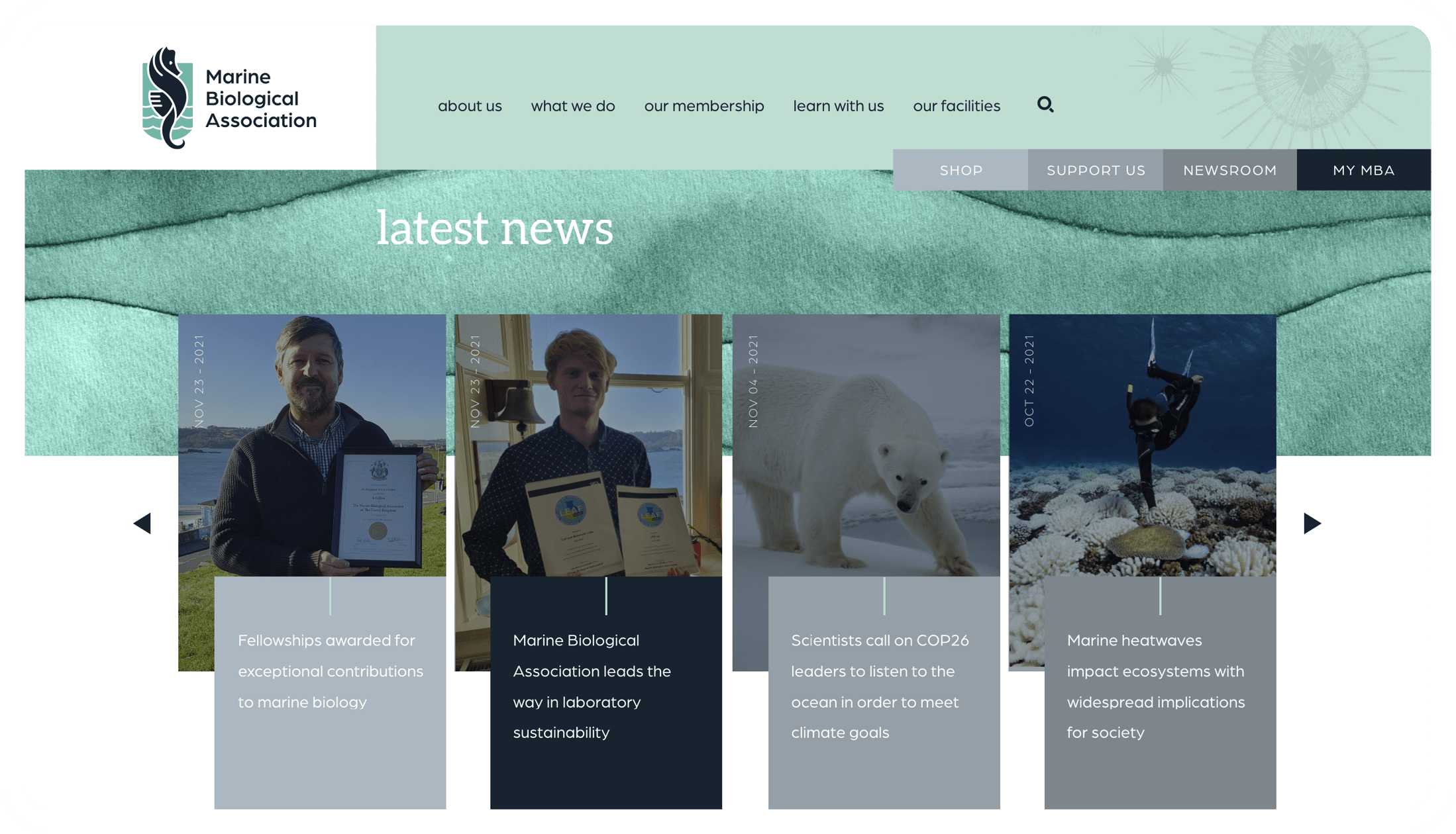
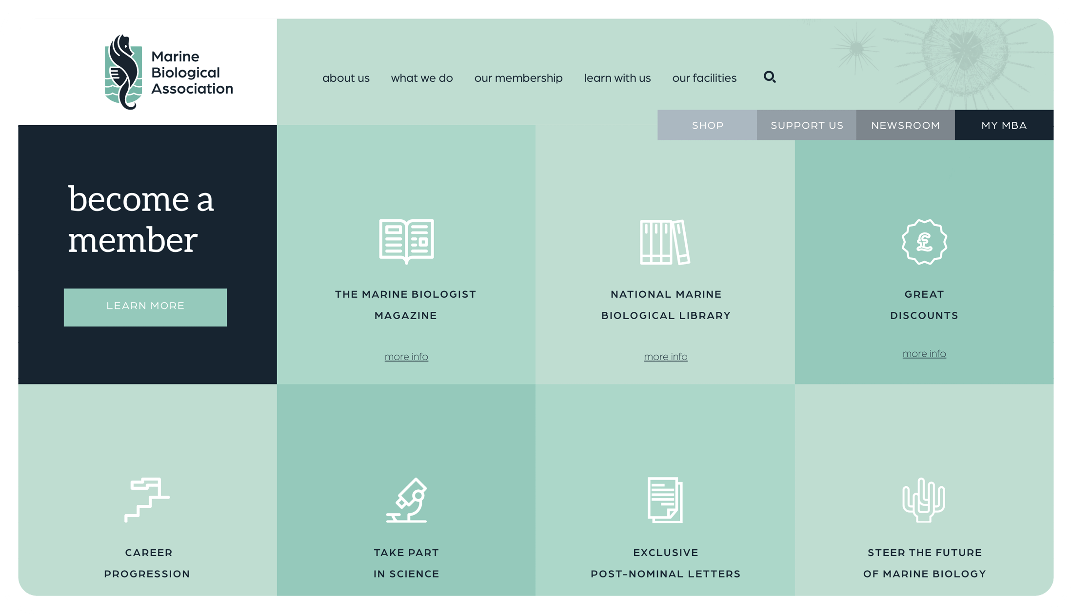
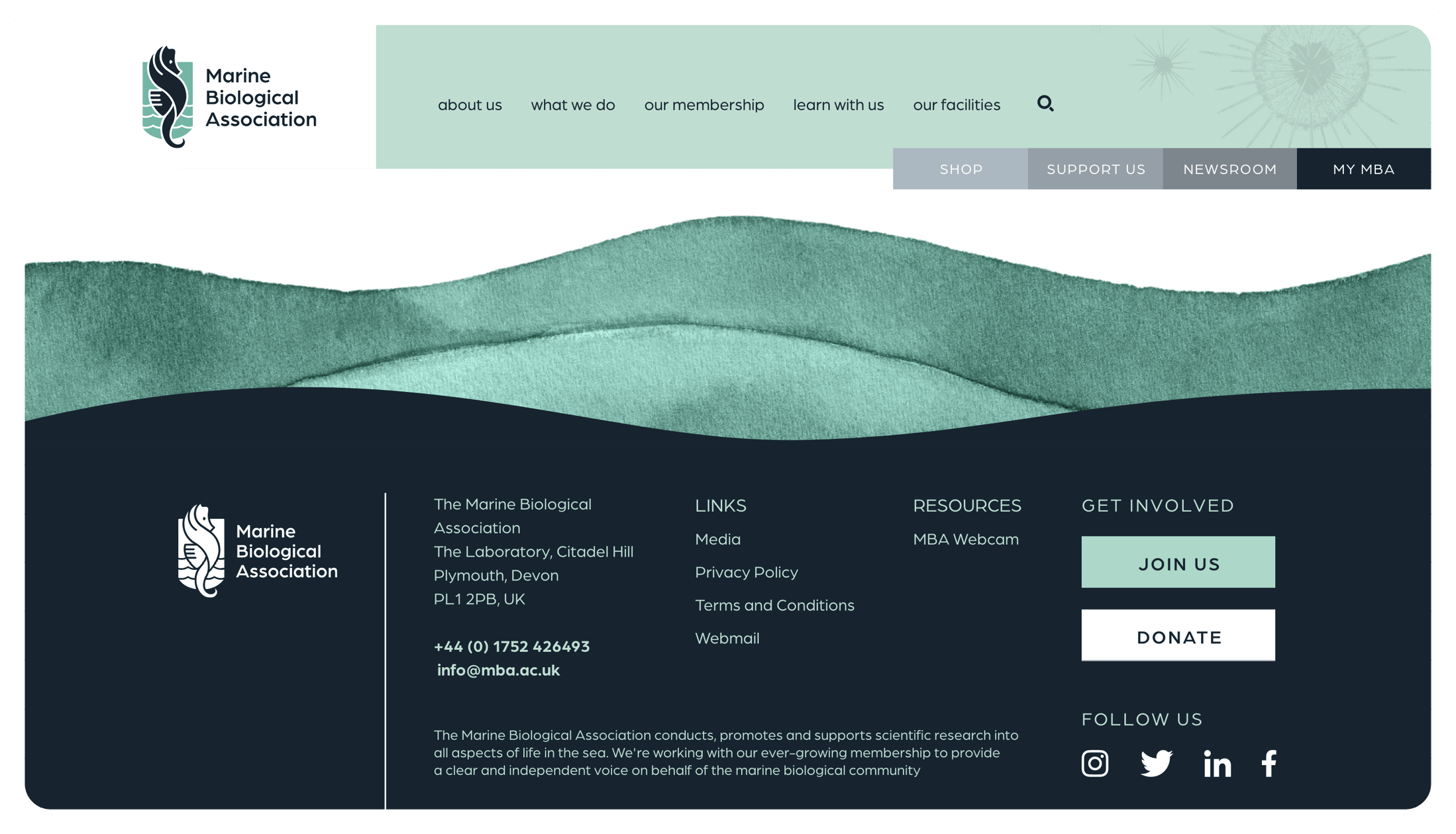
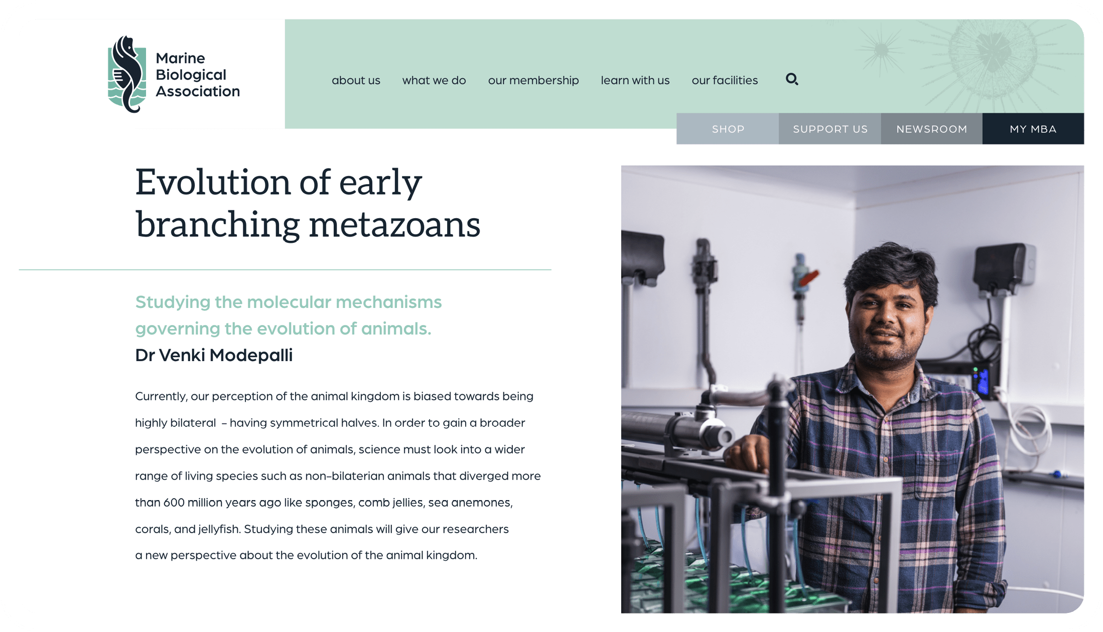
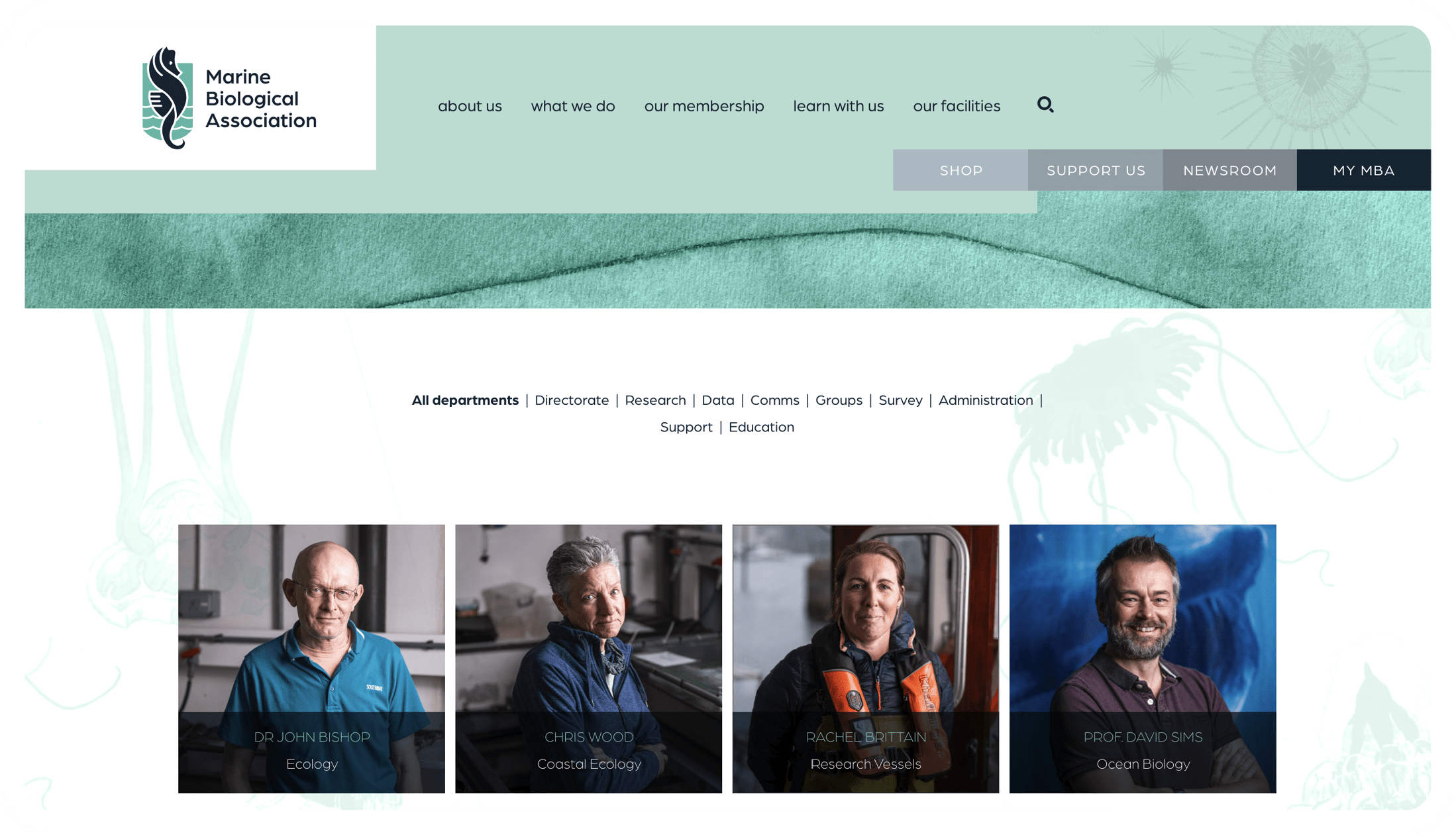
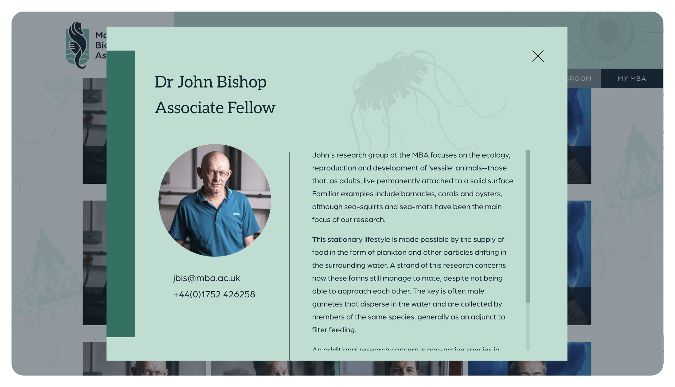
Content for the site was developed using the new tone of voice and it was designed around the content to fit the new branding. The end result was a site which showcased their research, allowed new members to access tailored content, encouraged donations and ultimately was a site for the MBA to be proud of.
A continued relationship.
Since the launch of the brand we have continued to work with the MBA to help bring the brand to life across the organisation. This includes developing the Young Marine Biologist visual identity, membership material and professional Annual Reports and Trustee Reports.
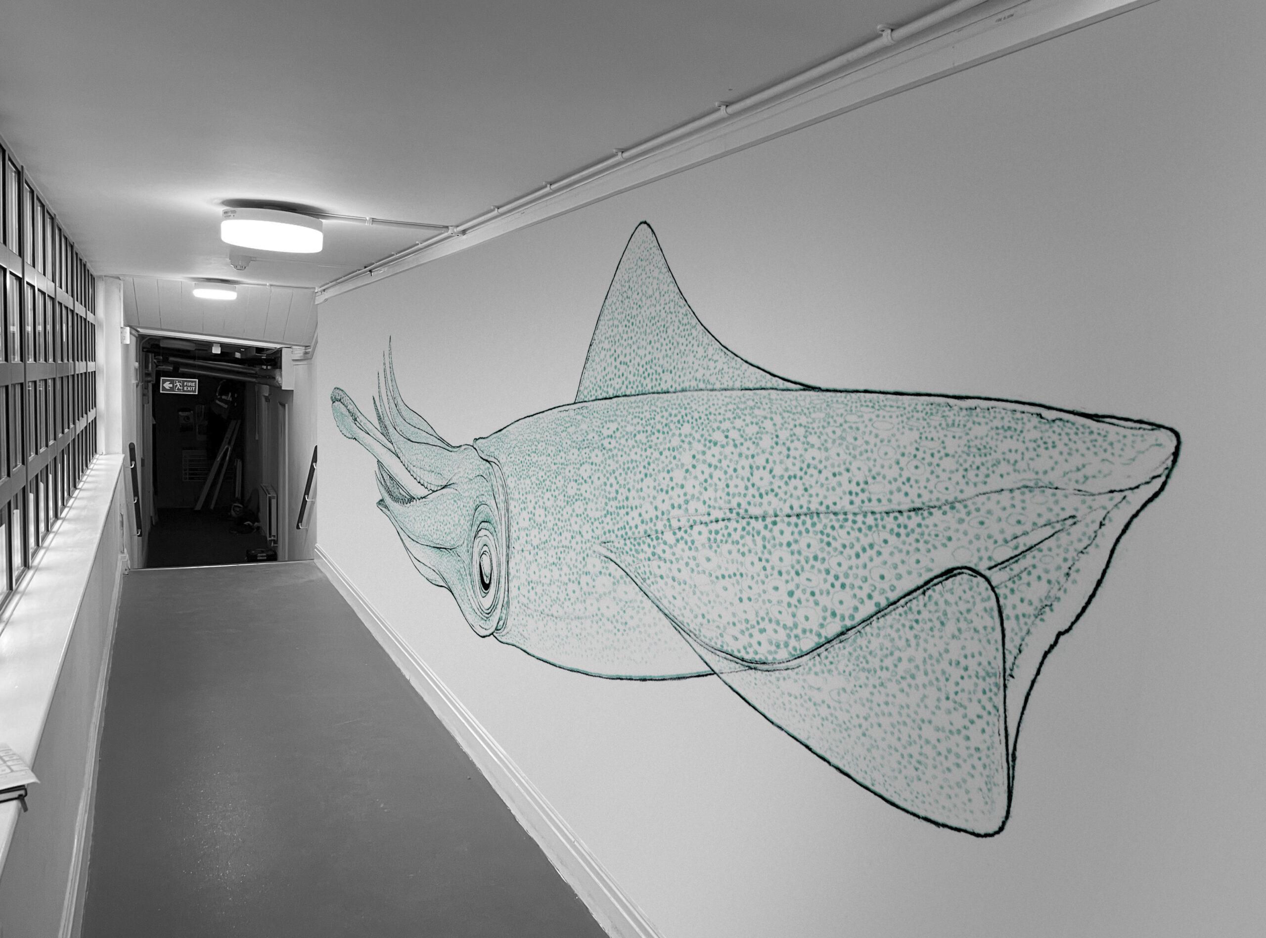
We have also created impactful signage, not only for the exterior of the building but also to help guide visitors to their new Microbiome Cell & Molecular Laboratory – the pinnacle of which is a giant illustrated squid leading the way down the corridor to a bespoke, 3D wooden entrance sign – certainly a memorable first impression!
We are looking forward to growing our relationship together.

Testimonial
“Since appointing Chalk & Ward in January 2022, we have been extremely impressed with their strategic, creative and digital abilities. From the initial brand strategy, they have developed a new, modernised brand and tone of voice for us which reflects our global position as an eminent learned society.
As an organisation with over 100 years of history behind us, such a significant change was never going to be easy but they made sure to retain the equity of our brand and everything was done in a very collaborative way so we were all brought along on the journey. Our website is an impressive showcase for our research and work and we look forward to a continued partnership with Chalk & Ward“
Maya Plass / Head of Communications / Marine Biological Association
